
Have you ever wondered why some colors seem to effortlessly complement each other while others clash in an instant? The answer lies in the artful science of color theory. In this intriguing exploration, we will dive deep into the realm of aesthetics, examining which 2-color combination reigns supreme. Whether you’re a fashionista looking for the ultimate outfit pairing or an interior decorator seeking harmony in your design scheme, this article aims to unravel the mysteries behind successful color combinations and help you make informed choices in your creative endeavors. Prepare to be inspired by our curated selection of stunning duos!
Why color combinations matter in design
Color combinations play a crucial role in design as they have the power to evoke certain emotions, set the mood, and enhance the overall visual impact of a piece. By using the right color combination, designers can create balance, harmony, and convey specific messages to their audience. For example, contrasting colors like black and white or red and green can create a bold and energetic effect, while complementary colors like blue and orange or purple and yellow can create a harmonious and pleasing aesthetic.
Moreover, color combinations in design also help with readability and legibility. The choice of colors for text backgrounds or graphics can significantly affect how easy it is for people to read or understand information. Designers must consider factors such as color contrast ratios to ensure that important content stands out clearly against its background. This becomes particularly important when designing for visually impaired individuals who may rely on high contrast combinations for improved accessibility. Additionally, cultural associations with colors should be taken into consideration when choosing color combinations. Different cultures may interpret colors differently based on their traditions, history, or social context. For instance, while white symbolizes purity in Western societies, it is associated with mourning in some Eastern cultures. These cultural nuances must be acknowledged by designers to avoid misinterpretation or causing offense unintentionally.
Exploring popular color combinations in design
One of the most popular color combinations in design is black and white. This classic pairing creates a high contrast effect that can instantly grab the viewer’s attention. Black and white can be used in various design styles, from minimalistic to elegant and sophisticated. For example, using black as the primary color with white accents can create a modern and sleek look, while using white as the dominant color with black accents can give off a clean and timeless vibe.
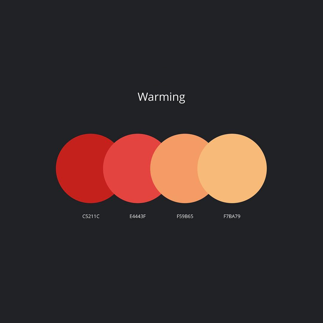
Another popular color combination is blue and yellow. This pairing often evokes feelings of warmth, joy, and optimism. Blue is known for its calming qualities, while yellow brings vibrancy and energy to a design. Combining these two colors can result in dynamic compositions that convey a sense of balance, harmony, or even playfulness depending on how they are used. Whether it’s designing a website or creating an advertisement, blue and yellow offer endless possibilities for capturing attention while maintaining a positive aesthetic. When it comes to popular color combinations in design, red and black cannot be forgotten. This combination exudes power, passion, and intensity. Red draws attention while conveying strong emotions like love or anger; meanwhile, black adds depth and sophistication to any composition. Together, they create an eye-catching contrast that demands attention instantly when used appropriately in design elements such as logos or packaging designs.
Evaluating the effectiveness of different color combinations
Color is a powerful visual tool that can significantly impact how we perceive and interact with the world around us. The combination of colors used in design and branding plays a crucial role in conveying messages, eliciting emotions, and creating desired experiences. When evaluating the effectiveness of different color combinations, it’s essential to consider not only aesthetics but also the intended purpose and target audience.
One important aspect to consider is color contrast. High contrast combinations, such as black and white or yellow and blue, can create a bold and visually striking effect that immediately grabs attention. These combinations are often used for signage or advertisements where visibility from a distance is crucial. On the other hand, low contrast combinations, like pastel hues or shades within the same color family, can evoke a sense of softness and harmony while maintaining a more subtle presence. Another factor worth exploring is color symbolism. Different cultures associate colors with various meanings and emotions. For instance, red often symbolizes passion or excitement in Western culture but may represent luck or celebration in Eastern cultures. Understanding these cultural nuances can help ensure that your chosen color combination aligns with your desired message and resonates with your target audience on an emotional level.
Factors to consider when choosing a color combination
When it comes to choosing a color combination, there are several factors that should be taken into consideration. Firstly, it is important to think about the intended mood and atmosphere you want to create. Different colors can evoke different emotions, so if you are aiming for a calm and relaxing space, consider soft pastel hues or cool shades like blues and greens. On the other hand, if you want to create a bold and energetic environment, vibrant and contrasting colors such as reds and yellows can be your go-to choices.
Another factor to consider is the purpose of the space or project in which the color combination will be used. For example, when choosing colors for a branding project, it is essential to align them with the company’s values and target audience. Research has shown that certain color combinations may have specific psychological effects on people. By understanding this psychology of colors, designers can strategically select color combinations that reinforce the desired message or brand identity. Lastly, practicality should not be forgotten when selecting a color combination. Think about how easy it will be to incorporate these colors into various elements such as furniture or accessories. Consider whether these color choices will age well over time and still maintain their appeal. Additionally, ensure that the chosen combination does not clash with any existing elements in your space or design.
Conclusion: finding the best color combination for you
In conclusion, finding the best color combination for you is ultimately about personal preference and individual style. While there are general guidelines and theories about color harmony and contrast, what matters most is how these colors make you feel. Experiment with different combinations that resonate with your personality and aesthetic.
It’s also important to consider the context in which you’ll be using these colors. Are they for a website or logo design? A room in your home? The purpose and intended atmosphere of the space play a significant role in determining the best color combination for it.
Remember that trends come and go, but your own unique style should be timeless. Don’t be afraid to take risks, trust your instincts, and choose colors that make you happy. After all, when it comes to finding the best color combination for you, confidence is key.
Leave a Reply