Have you ever wondered why some outfits just don’t seem to work, no matter how stylish the individual pieces may be? It’s all about color combinations. We’ve all been there – staring at our overflowing closets, feeling lost and overwhelmed by the vast array of hues. But fear not! In this article, we’ll delve into the world of fashion faux pas and reveal which colors should never be worn together. Get ready to unlock the secrets behind creating harmonious ensembles that will make heads turn for all the right reasons.
Why color combinations matter in fashion
Color combinations are a vital aspect of fashion that can make or break an outfit. The right combination has the power to enhance your features, make you look vibrant and put-together, while the wrong choice can leave you looking dull and uncoordinated. A good color combination creates harmony between different elements of your ensemble – from clothing and accessories to makeup and even hair color. By thoughtfully pairing complementary colors, you can create a visually appealing and impactful look.
Furthermore, color combinations also play a significant role in expressing your personal style and mood. Different colors evoke specific emotions – warm tones like reds and yellows convey energy and passion, while cool hues such as blues and greens exude calmness and tranquility. Carefully combining these colors allows you to communicate subliminal messages about who you are as an individual or what image you wish to project. Understanding the psychology of color is key in creating outfits that accurately reflect your personality or convey the desired message for any occasion. Ultimately, mastering the art of color combinations in fashion enables you to effortlessly stand out from the crowd while exuding confidence. It allows your style to become an extension of your character by highlighting your best features while giving subtle hints about who you are deep down inside. So next time when planning an outfit or shopping spree, remember that choosing harmonious colors is not just about aesthetics –it’s a powerful tool that allows you to express yourself through every piece of clothing on your body!
Complementary Colors:
Complementary colors truly have a mystical allure, as they bring harmony and balance to any visual composition. These color pairs sit opposite each other on the color wheel, creating a striking contrast that catches the eye. Yet, despite their inherent appeal, there are some combinations of complementary colors that can clash rather than complement each other.
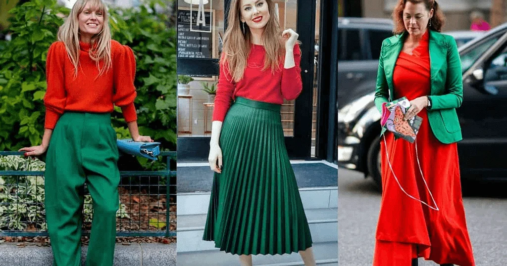
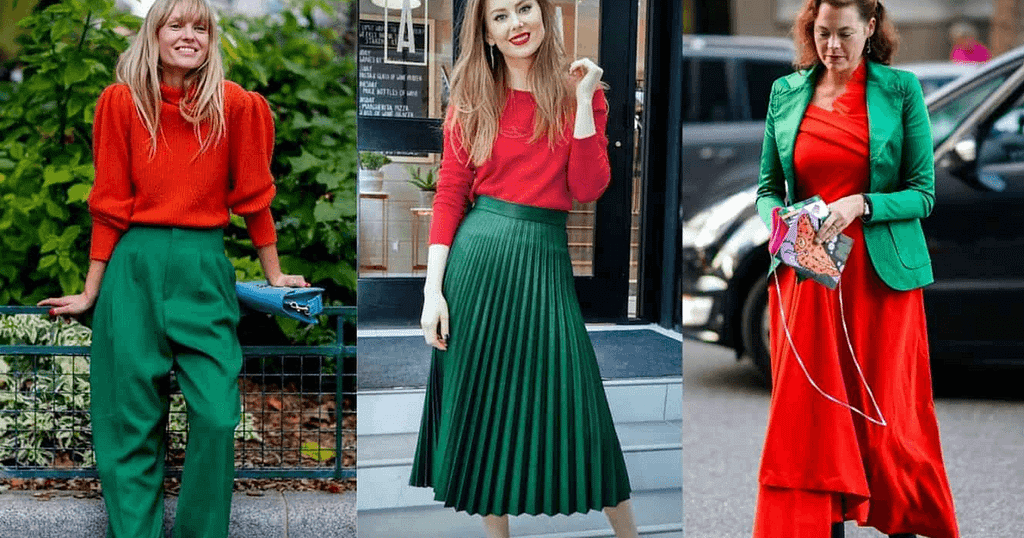
One such combination is orange and blue. While both colors are vibrant and energetic in their own right, when placed side by side, they can create visual chaos. The high contrast between these two hues can be overwhelming and jarring to the eyes. It is advisable to use these complementary colors sparingly or in more muted shades to achieve a harmonious effect. Another challenging pair is red and green. These iconic hues may remind you of the Christmas holiday season, but when used together in large doses or with high saturation levels, they can evoke intense vibrations that clash rather than complement each other. To use them effectively in an ensemble or design project, it is best to opt for darker shades of red and green or explore variations within the same family of complementary colors.
Clash of the Opposites:
The Clash of Opposites in the world of fashion is a mesmerizing dance between colors that should never be worn together. It’s like watching oil mix with water – unpredictable, fascinating, and sometimes even jarring to the eye. The beauty lies in embracing these clashes and using them as a tool for self-expression.
One classic example is pairing black and navy blue. Traditionally seen as a contradiction, combining these two shades creates a powerful statement that exudes confidence and sophistication. By breaking the fashion rules, you challenge societal norms, proving that opposites not only attract but can also complement each other flawlessly. Another audacious combination is red and pink – a clash thought to cause chaos in any outfit. However, this daring duo has recently been embraced by fashionistas worldwide and has become an iconic pairing for those seeking to make an impact. When styled correctly, these two hues convey strength, femininity, and the rebellion against conventional color conventions.
Warm and Cool Tones:
Warm and cool tones play a significant role in the world of color theory. Understanding how these tones work together, or don’t, is key to creating harmonious combinations in your outfits or interior design choices. Warm tones such as reds, oranges, and yellows give off a vibrant and energetic feel, evoking feelings of warmth and excitement. Cool tones like blues, greens, and purples on the other hand have a calming effect with their soothing nature that promotes relaxation.
When it comes to pairing warm and cool tones together, caution must be exercised as certain combinations may clash rather than complement each other. For instance, wearing an outfit with bright orange pants paired with a cobalt blue top may create visual discordance since orange is warm while cobalt blue is cool. On the other hand, combining soft pastel yellow with light aqua green can result in a visually pleasing harmony due to both colors being from the warm side of their respective spectrums. Understanding the principles behind warm and cool tones allows for endless opportunities for creative expression through color coordination. Exploring different combinations can lead to new discoveries that break traditional norms while still maintaining aesthetic appeal. By incorporating warmth into cool backgrounds or introducing pops of cooler colors into warmer schemes, you can create balanced compositions that capture attention without overwhelming the senses.
Monochromatic Mishaps:
Monochromatic Mishaps: When it comes to fashion, monochromatic outfits can make a bold statement. However, there are definitely instances where this trend can go horribly wrong. One common mishap is combining shades of the same color that clash with each other. For example, pairing a pale pink top with a bright fuchsia skirt might seem like a daring choice, but in reality, it’s an eyesore waiting to happen. Another monochromatic mishap occurs when the shade chosen does not flatter the wearer’s skin tone. While black is often hailed as an easy go-to for any occasion, not everyone can pull off head-to-toe ebony. People with fair skin tones may appear washed out while those with darker complexions may seem even more somber in all-black ensembles.
To avoid these monochromatic disasters, it’s important to choose shades within the same color family that complement each other and work well together. Experimenting and finding your own ideal combinations can ensure that you turn heads for all the right reasons when rocking this popular trend. Just remember, not all colors were meant to be worn together – even if they belong to the same spectrum!
Conclusion:
In conclusion, understanding which colors should not be worn together can greatly impact our overall style and image. By pairing complementary colors or sticking to monochromatic looks, we can create visually appealing outfits that enhance our features and reflect our personal style. It’s important to remember that rules in fashion are meant to be broken, but knowing the basics will help us make more informed choices and avoid potential fashion disasters.
Additionally, when experimenting with colors, it’s essential to consider the context and occasion. While bold color combinations may work well for casual outings or creative events, more subdued and classic pairings might be preferable for professional settings. Ultimately, confidence is key – if a specific color combination makes you feel amazing, go for it! Fashion is a form of self-expression after all. Next time you find yourself standing in front of your closet feeling stuck on what to wear together, take a moment to think about the colors that might clash or overpower each other. Embrace your creativity while keeping these guidelines in mind; who knows – you might just discover new favorite combinations that perfectly express your unique sense of style! Remember: wearing clothes that make us feel good ultimately translates into radiating confidence and positivity to the world around us.
Leave a Reply